Colour theory in graphic design

I have seen various wheels o the colour theory talking about primary secondary and Tertiary colours to be used in cohesion on logo designs or brand designs and so forth however i find that some of the wheels differ are there different theories within graphic design?

It’s easy to raise an average design to an awesome composition with just the right colors. On the other hand, looking at a color wheel with so many possibilities, creating a palette, even with just two colors, can be really intimidating.

Even though this is a matter of taste (a combination of colors beautiful to me doesn’t need to be beautiful to you), there are some guidelines, that can help you to achieve a color scheme which works for your design.
THE PSYCHOLOGICAL ASPECT

Warm colors are stimulating, a synonym for energy, while cold hues are composed and better represent calmness, right? Well, not necessarily. It’s highly important to do your research before choosing a color scheme. Ask yourself this question: “Who is your target audience?” The answer impacts your choice, as the concepts and meanings for colors vary from culture to culture.

The black that evokes mourning and mystery in western culture, for example, can mean rebirth in some eastern countries. White, on the other hand, usually a synonym of peace and purity, is the color of death and bad luck in some asian countries.

Useful info, thanks for the post! Properly chosen colors are very important! I also want to share good blog about design https://steelkiwi.com/blog/category/design/, there are many fresh articles about mobile, responsive and adaptive design development.
 
Color is important factor to represent your services or products. If you design website for school then design and color combination will different as compare IT services website. Psychology of Color is also big factor to increase conversion.
 
It’s easy to raise an average design to an awesome composition with just the right colors. On the other hand, looking at a color wheel with so many possibilities, creating a palette, even with just two colors, can be really intimidating.

Even though this is a matter of taste (a combination of colors beautiful to me doesn’t need to be beautiful to you), there are some guidelines, that can help you to achieve a color scheme which works for your design.
THE PSYCHOLOGICAL ASPECT

Warm colors are stimulating, a synonym for energy, while cold hues are composed and better represent calmness, right? Well, not necessarily. It’s highly important to do your research before choosing a color scheme. Ask yourself this question: “Who is your target audience?” The answer impacts your choice, as the concepts and meanings for colors vary from culture to culture.

The black that evokes mourning and mystery in western culture, for example, can mean rebirth in some eastern countries. White, on the other hand, usually a synonym of peace and purity, is the color of death and bad luck in some asian countries.
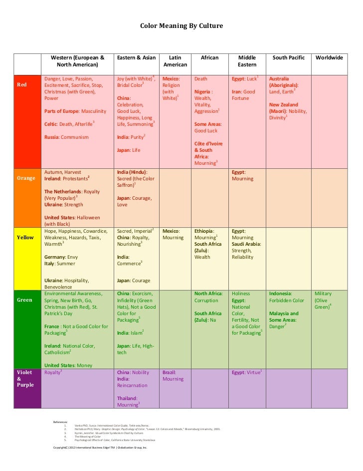
Hi there i apprciate you long response and you raise some very valid points on design. What looks good as a design to me may not look good to you. I have dug deeper into the colour theory out of pure curiousty and found many elements in nature actaully follow it too. For example the color schems on certian birds witll be blue and orange. Its quite crazy when you think how intewieved it all is.

I like that you mention target markets as demographics and cultures can interpret colours in a VERY diffrent way. So from a marketing perspective research on your intended target market is surely a must. Like you mantion black , what about red , means danger to most of us ... in china however its signifies luck.

color-chart-1-728.jpg


Have a look at that crazy how different we perceive things.
 
Back
Top